 (
(Hello friends!
I’m back with a fun article this week:
10 Fantastic Acupuncture Websites to Inspire You – And How You Can Emulate Them to Get More Patients Online
Before I dive in and showcase these gorgeous, inspiring acupuncture websites, I want to talk about why they’re outstanding.
What do all these websites have in common?
- They look great on desktop AND mobile.
- They have a “Schedule Now” button, link, or phone number included “above the fold” (more on what “above the fold” means in a bit).
- They’re beautiful and functional.
- They have cohesive branding across the website – logo, images, text, etc.
- They’re easy to read, with sufficient white space and a good balance of text and on-brand images.
Let’s talk about the concept of “above the fold.”
In website creation, “above the fold” is essential. “Above the fold” is everything you can see when you initially land on a website. This can look a bit different depending on whether you’re looking at a website on your desktop or mobile. It’s the first impression of a website, and it needs to “wow” the visitor and convince him or her to stay.
Remember, the average attention span of online viewers is that of a goldfish – less than eight seconds. So you’ve got to convince them to stay almost immediately, and much of that depends on what you include on your website “above the fold.”
What makes an acupuncture website functional, i.e., user-friendly?
- “Schedule Now” button or phone number (if online booking isn’t available) is “above the fold” on every page
- Email opt-in in multiple places
- Contact and location information are easy to find. Don’t make people work too hard to find that information.
- Pages can be accessed from multiple places

Any other suggestions for a great website?
- Make testimonials prominent/easy to find (if you can use testimonials in your country).
- If you don’t want to use the phrase “Testimonials,” use “Praise” instead. Either put the testimonials on a rotating widget on your homepage or consider a link on your main menu called Praise.
- Blog regularly to increase the number of pages on your website (which both improves your SEO and establishes you as an expert in your specialty).
- Any text on your website should answer questions from the perspective of your potential patients. Try to answer the questions, “Why should I be interested? Why is it worth the investment of my time and money? How would this solve my problems?”
- Photos should be professional and match your branding colors, including your head shot. Please no photos of you at your wedding, or photos where you had to cut out another person. These are not professional photos. If you can’t afford professional head shots or photos of your office, do a trade with a local photographer. (I’ve done many trades with photographers for professional head shots. It’s a great option!)
- Boost your SEO with my free checklist: 4 Tips to Boost Your Acupuncture Website’s SEO
Okay, let’s look at these beautiful websites! I encourage you to click on each one and explore. Have fun!
1. Empower Chiropractic & Acupuncture in New Gloucester, Maine:
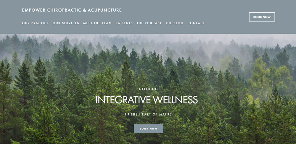 http://www.empowerchiroacu.com
Why I love it:
- “Book Now” button is seen TWICE above the fold and draws your attention.
- Beautiful imagery is visually relaxing and evokes the feeling you’ll get during an acupuncture treatment.
- Located in Maine, the image also makes me think of the forests in Maine.
- Text is clean, menu is spaced out. Essentially, the text is easy to read and easy on the eyes.
2. Wild Blue Acupuncture and Wellness in Lafayette, Colorado
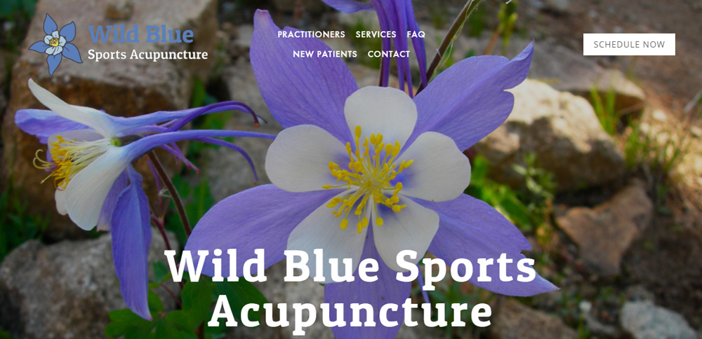
http://www.wildbluesportsacupuncture.com/
Why I love it:
- “Schedule Now” button is prominent above the fold.
- Menu is easy to see and navigate.
- Striking landing page – image is perfectly congruent with logo!
3. Bee Cave Acupuncture in Austin, Texas
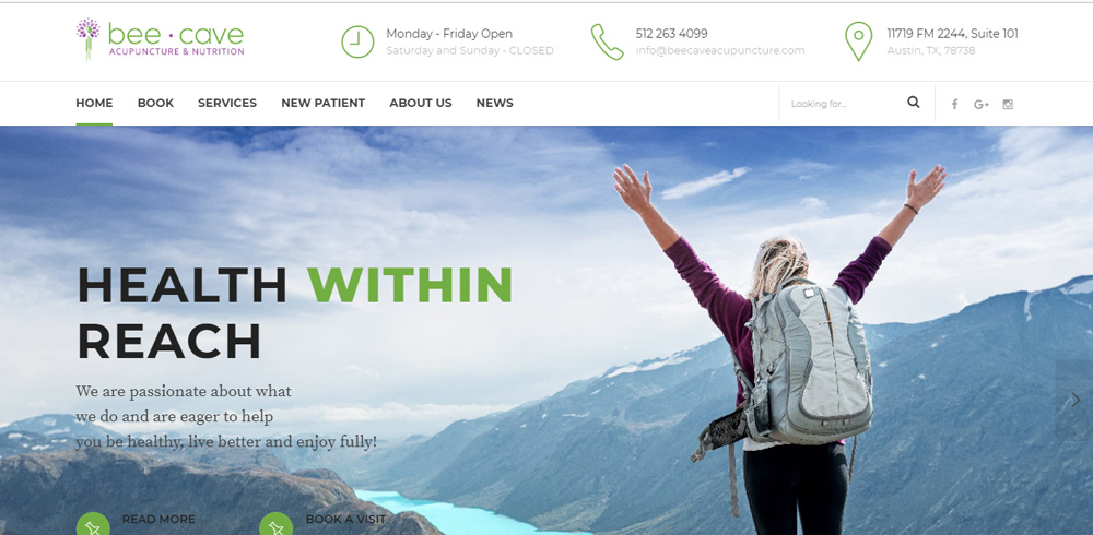
http://www.beecaveacupuncture.com
Why I love it:
- Love the white strip along the top with clear, easily visual contact info, hours, and location. All the practical info, immediately noticeable, right at the top. Perfection.
- Visually appealing landing page with rotating images that are all consistent with brand colors.
- Brand is consistent (same color greens and blues repeated).
4. Buffalo Sports & Orthopedic Acupuncture in Buffalo, New York
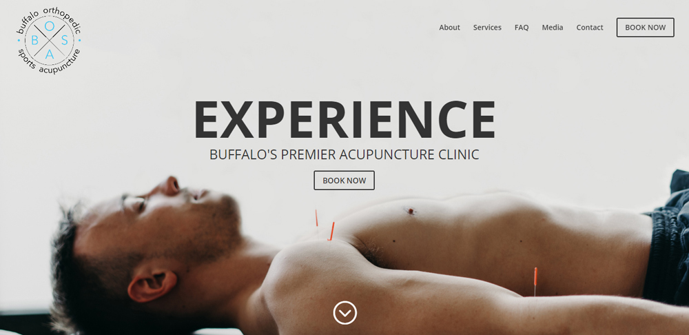
Why I love it:
- There aren’t a lot of acupuncture clinics with masculine branding. This is a great example to follow.
- It’s light and bright with lots of white space – visually uncluttered.
- “Book Now” button (two actually) are above the fold and draw the eye immediately.
5. Six Fishes Acupuncture in Philadelphia, Pennsylvania
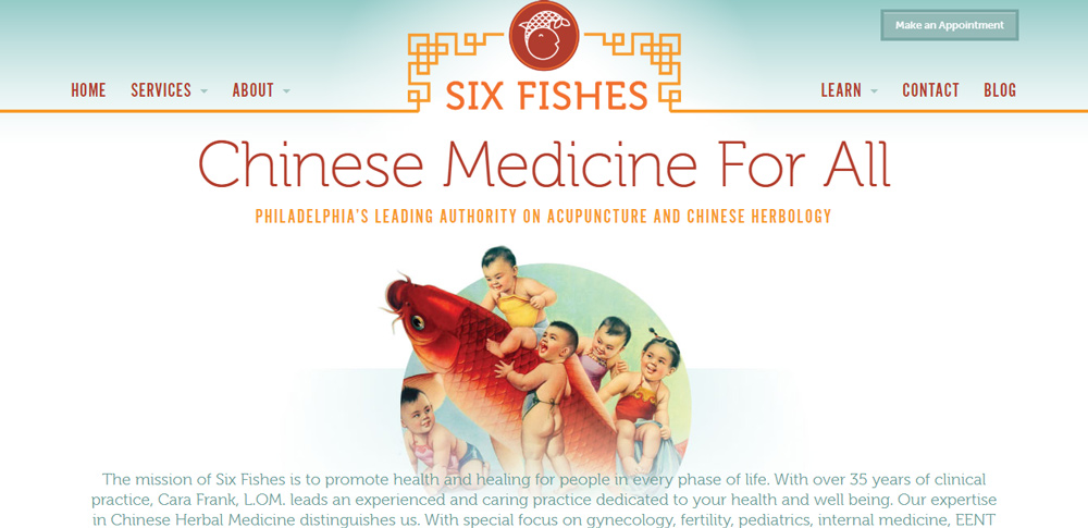
Why I love it:
- Unique, fun but professional branding.
- “Book Now” button is prominent, at the top, above the fold.
- Links are easy to navigate.
6. Family Tree Acupuncture in Mineapolis, Minnesota
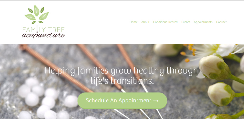
Why I love it:
- “Schedule Now” button is huge and above the fold, on both mobile and desktop. You can’t miss it!
- Love the white space and cohesive branding throughout the website.
- Clear, easy to navigate, uncluttered layout.
7. Ritual Medicine in Victoria, British Colombia, Canada
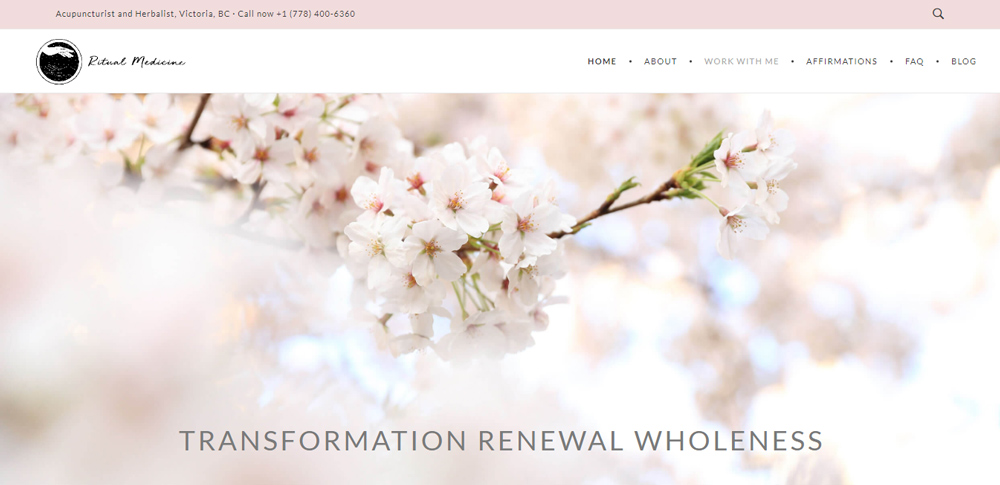
http://www.ritual-medicine.com
Why I love it:
- Contact information is at the top – there is no online booking, but the phone number is up top. It’s the first thing you see.
- Cohesive branding throughout.
- Easy to navigate.
9. Cloudgate Acupuncture in Melbourne, Australia
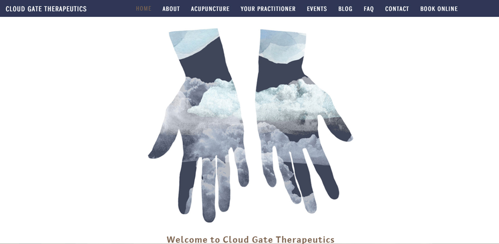
Why I love it:
- Beautiful, unique, memorable branding. Memorable is always great in marketing!
- Lots of visual white space, which evokes a peaceful, unhurried and uncluttered feeling.
- “Book Now” button at the top of the page.
- Superbly consistent branding throughout.
9. Flourish Boston in Boston, Massachusetts
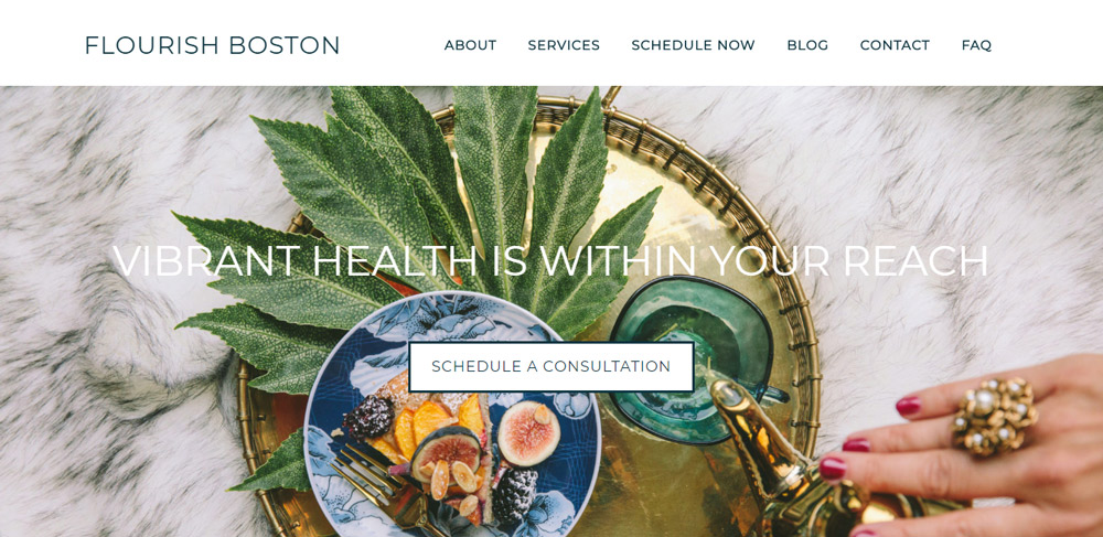
- Gorgeous, fresh and stylish imagery.
- Whimsical, magazine-style head shots for the acupuncturist.
- Excellent blog.
- “Schedule Now” link (twice!) above the fold.
10. Phoenix Rising Acupuncture in Houston, Texas
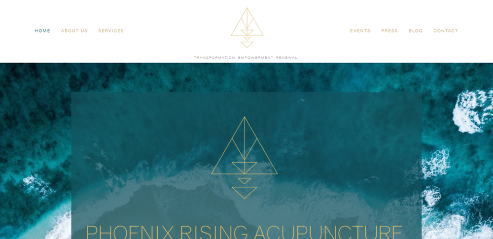
http://www.phoenixrisingacu.com
Why I love it:
- Unique, beautiful branding that is very consistent across all platforms, including social media.
- Just below the fold (at least on my desktop computer visual) is the “Schedule Now” button. I would move this up into the menu along the top of the website.
- Other than that, a very cohesive, appealing website.
A few more thoughts:
Where did I find these acupuncturist websites?
These are all acupuncturists that I follow on Instagram, because I enjoy their brands, and because IG is my favorite social media platform.
Keep in mind – many of your potential patients also spend a lot of time on Instagram!
So please don’t make any of these relatively common mistakes with your Instagram account:
- Not including a link to your website in your bio
- Having a link in your bio that does not work
- Not making your account public (why?!)
I ran into a bunch of IG accounts that looked cohesive with wonderful branding and I felt excited about how beautiful their websites must be. But in some cases, I found that the link in their bio either didn’t lead me to their website or was broken :/
Check in on your social media every every once in awhile, just to make sure everything is operational.
Hope you enjoy these and are inspired to make tweaks to your own website, to help you funnel in more patients through the internet!
Great post Michelle and great inspiration. Loved the Buffalo Acupuncture site! I recently redesigned my website myself (https://www.balancedhealthacu.com) and really enjoyed the experience. For mine I wanted two calls to action to be clear for my site: to either call for an appointment or sign up for my email list. I’ve been focusing on Pinterest as of late but will have to jump on the Instagram bandwagon!
Absolutely love your site, Leslie! High five for the call to action twice above the fold on the landing page. And I love that you put your face on the homepage – such a good choice! It helps people start getting to know you right away and your picture is so approachable 🙂
Thanks so much Michelle 🙂 Appreciate it xo
Great website, Stefanie! Happy to share such solid design 🙂
Absolutely love this article! My question would be what would you recommend for someone attempting to build their own site? Is it even possible to do (with minimal budget for a new graduate)? Or would you recommend paying someone to create a site? Where would I start?
Hi Jasmine! Thanks for your comment. This is a great question. I think it depends on how savvy you feel about websites. There are lots of great low-cost options out there that you customize your own website, but it does take a bit of time and committment to making it look professional. I love to sit and spend time with my websites, and so I tend to do them myself – until I get to the point that I want a customization that either A) I don’t know how to do, or B) would just take so much time that it’s not practical. I use Wordpress, which is for more advanced users, I’d say – but that also allows some great customisations. When I get to a place where I want someone else to do something for me, I use Fiverr.com – which is an awesome website of graphic designers, videographers, and web designers with services all starting at $5. If you do go with Wordpress, I recommend Waleed (https://www.fiverr.com/waleedview?source=Order+page+seller+link) – he does all my fancy customizations at this point. If you truly don’t have a desire to design your own website, then I my favorite option is to do a trade with a web designer. Alternatively (and I’m not sure how much I love this idea, since student loans are so hefty to begin with), you could take out a bit of extra money in student loans before you graduate to put towards webdesign. Hope this helps!
Love that post Michel. I wonder what are your thoughts about my site http://acufamilyclinic.com
although there is a language barrier.. LOL
Hi Ronen! Love your website! Very clean and organized. I was able to use Google translate and I like how you specifically mention cosmetic acu, pain, fertility and sports acupuncture – I take it these are your specialties? My only suggestion is a small one – to say “Call for an appointment today” or something similar along the top of your page instead of “Contact” next to your phone number. That way it’s super clear they should call for an appointment. Otherwise it looks great! 🙂